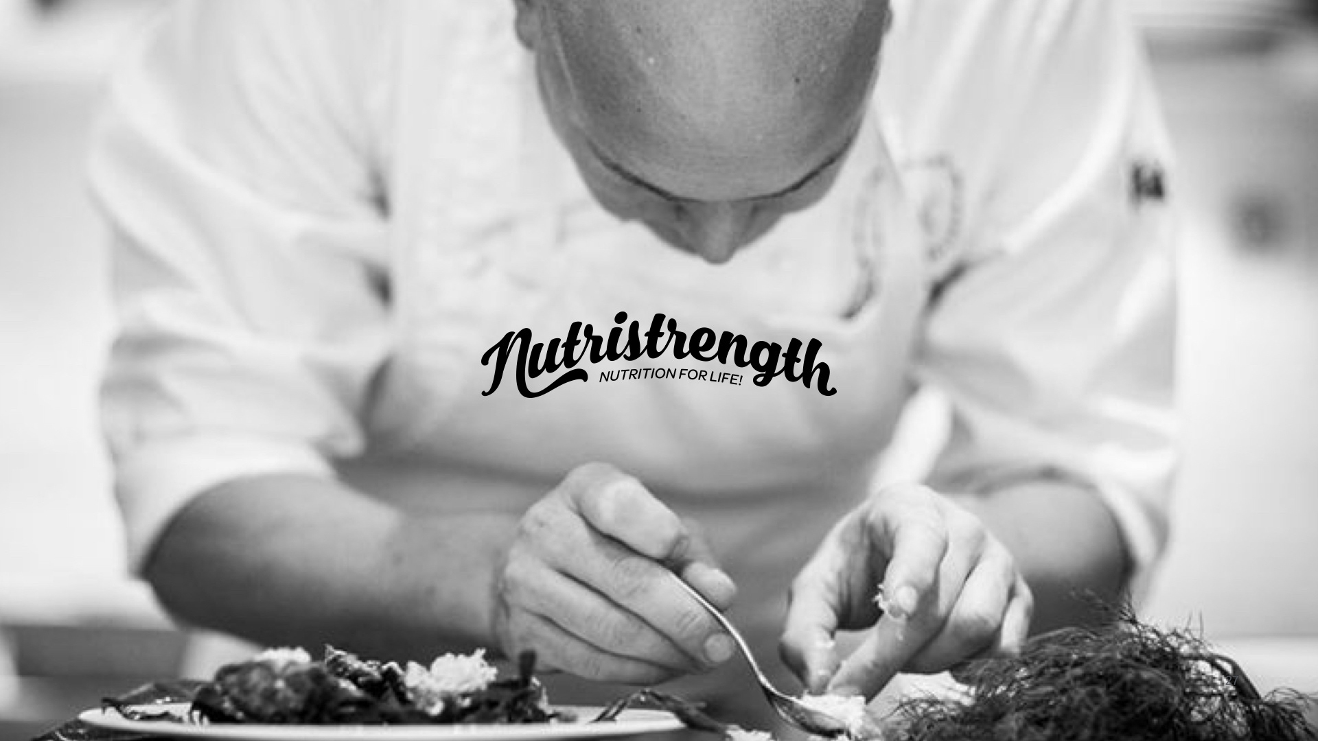
Nutristrength Rebrand
We worked closely with Nutristrength to help them develop a new brand identity that was accessible by both male and female consumers. Their previous identity was male focused and was beginning to feel stale from lack of standout from an already saturated market. Below are steps from the process we worked through to help them reshape the brand and push them into a completely new category - designed to feel comfortable on the shelf of a premium supermarket as well as independent sports and health stores, globally.
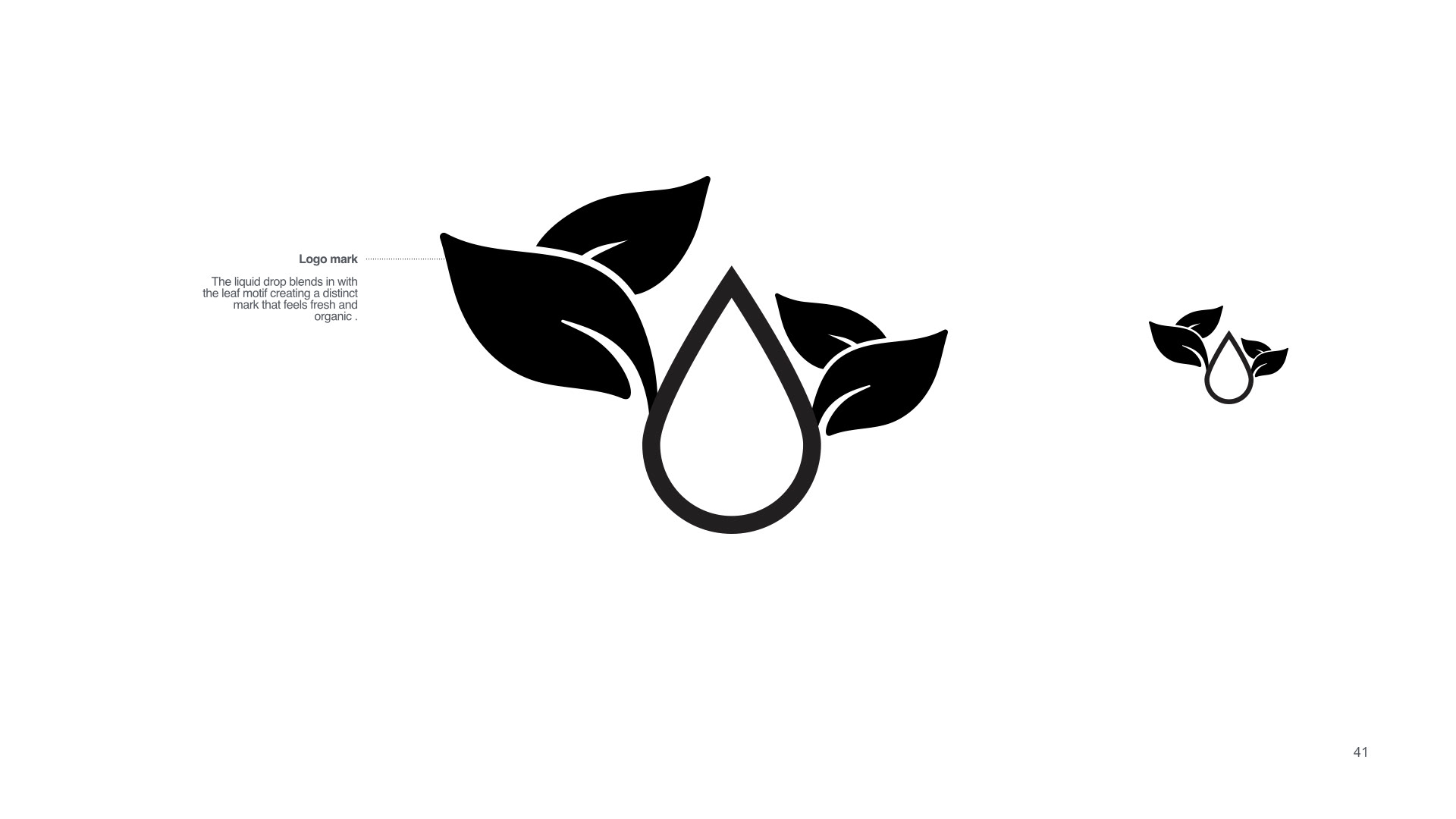
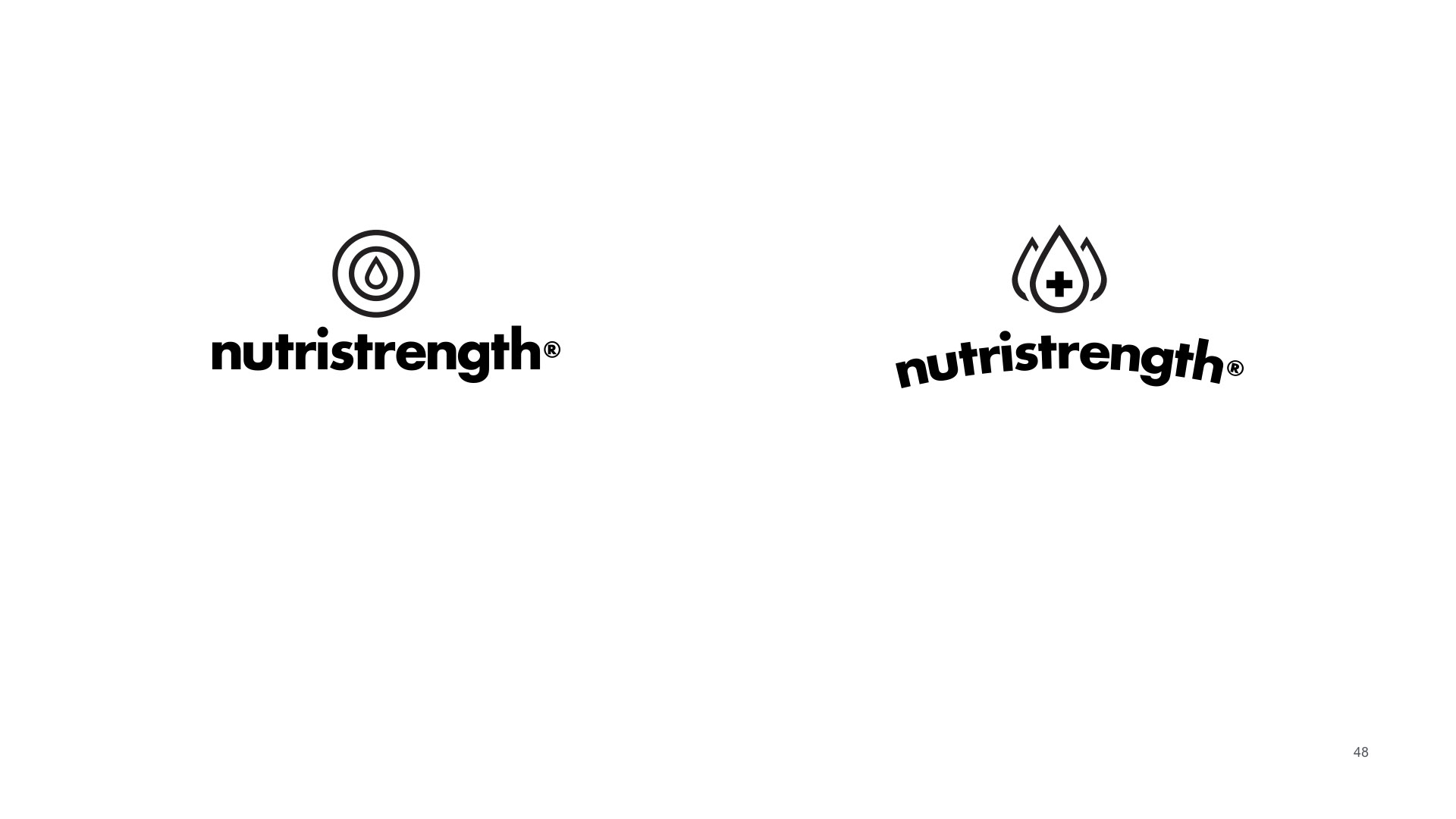
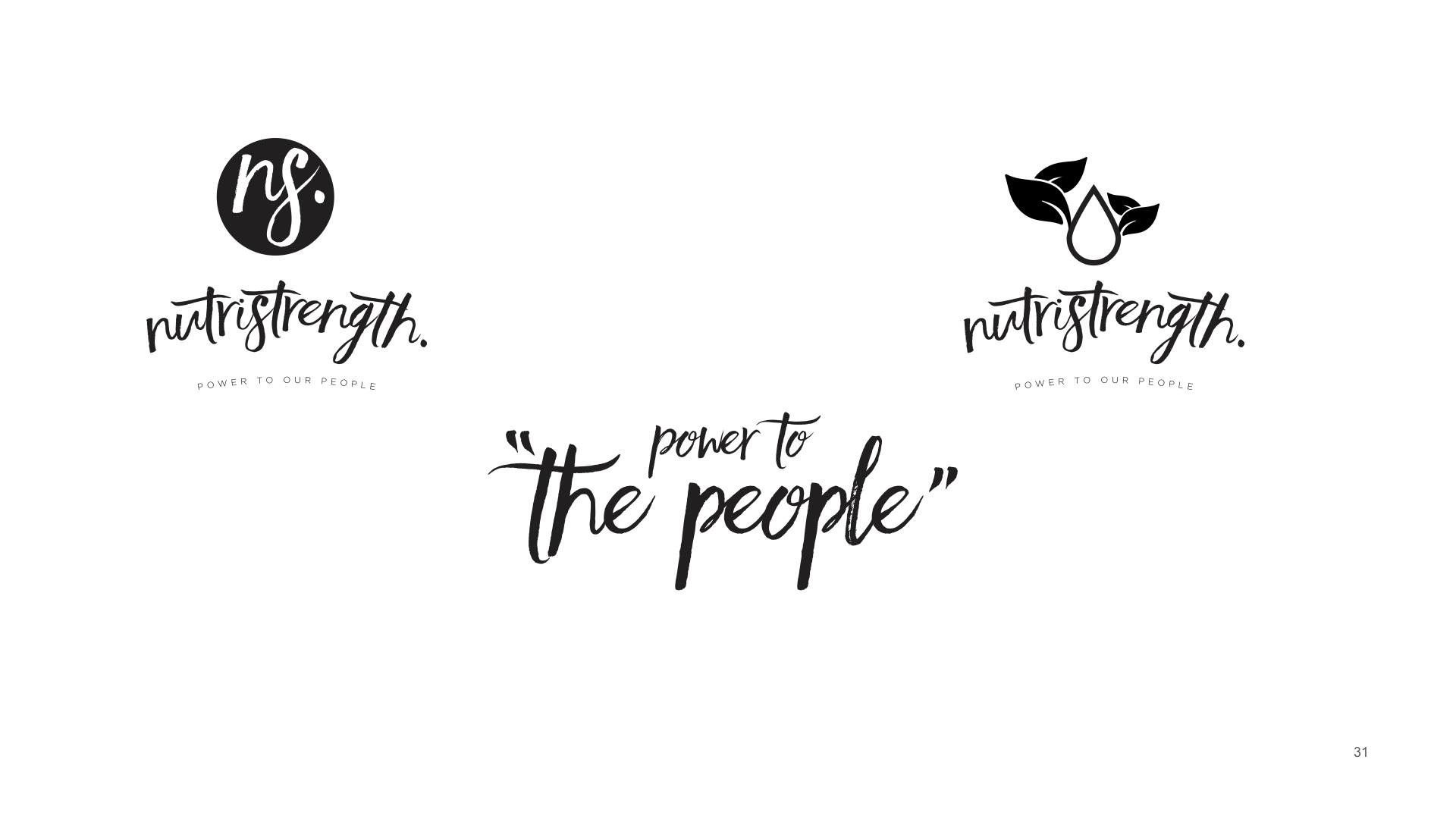
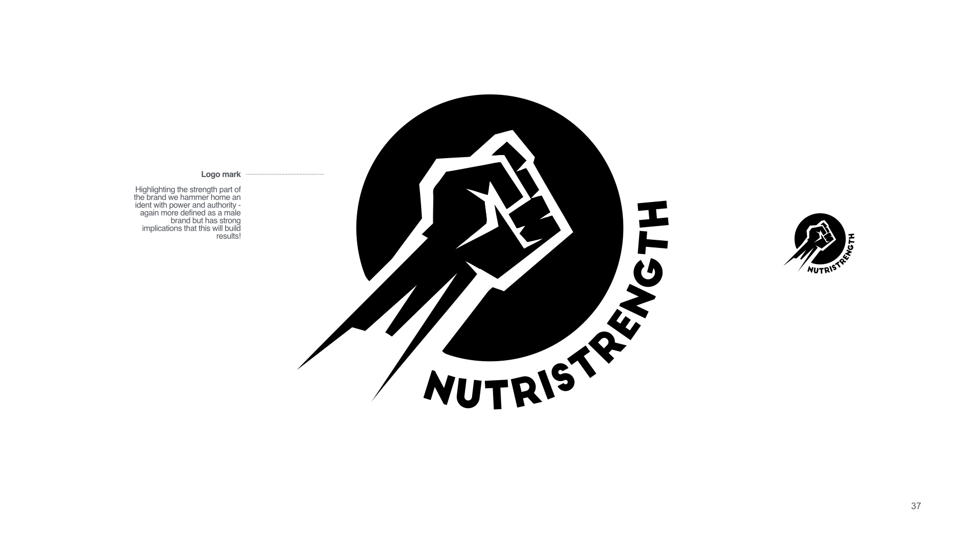
Early stages of logo Development...
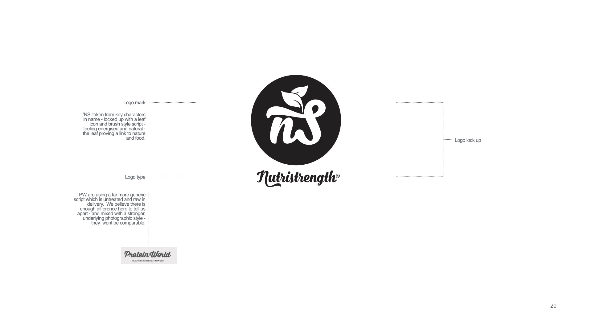
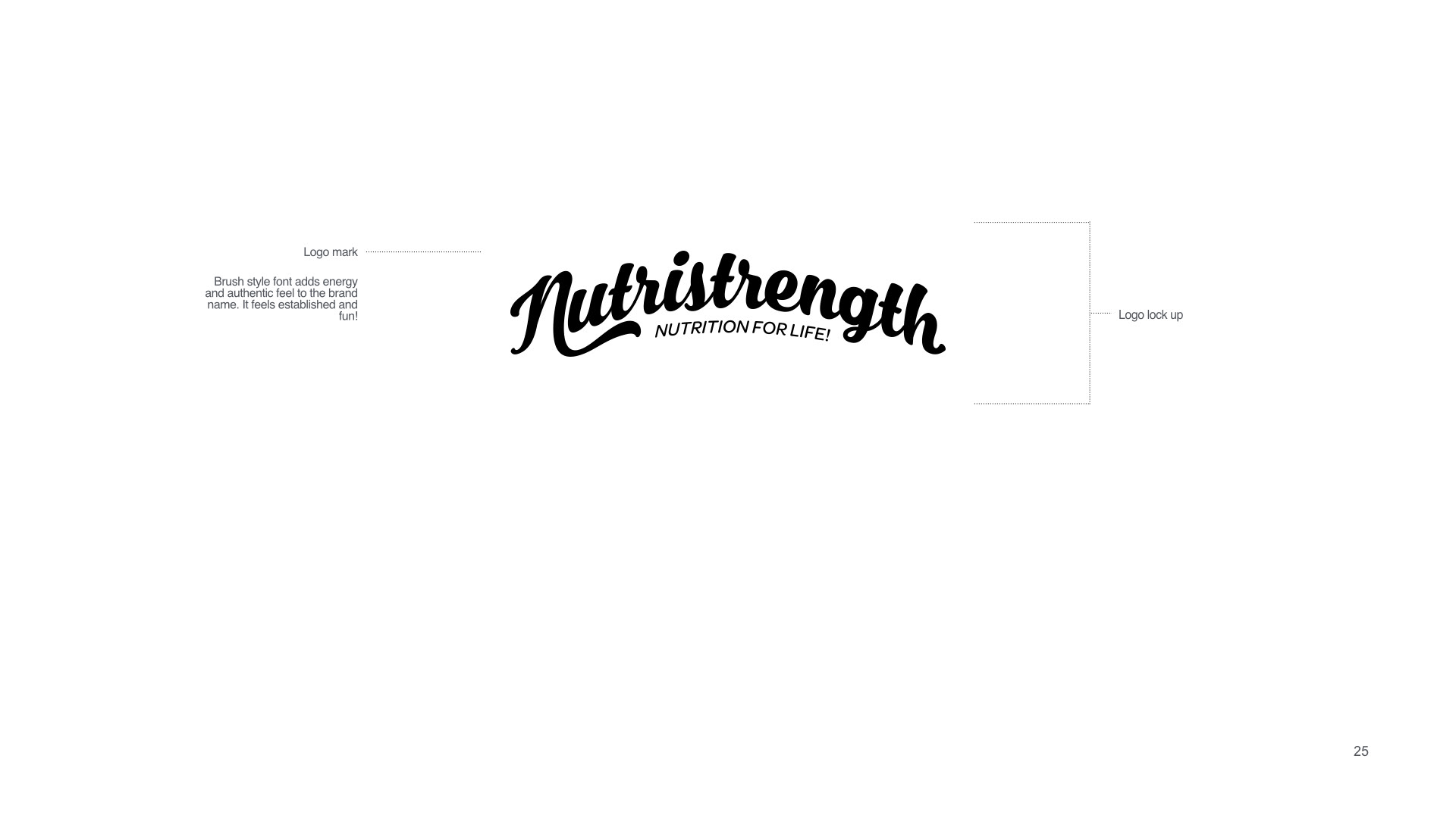
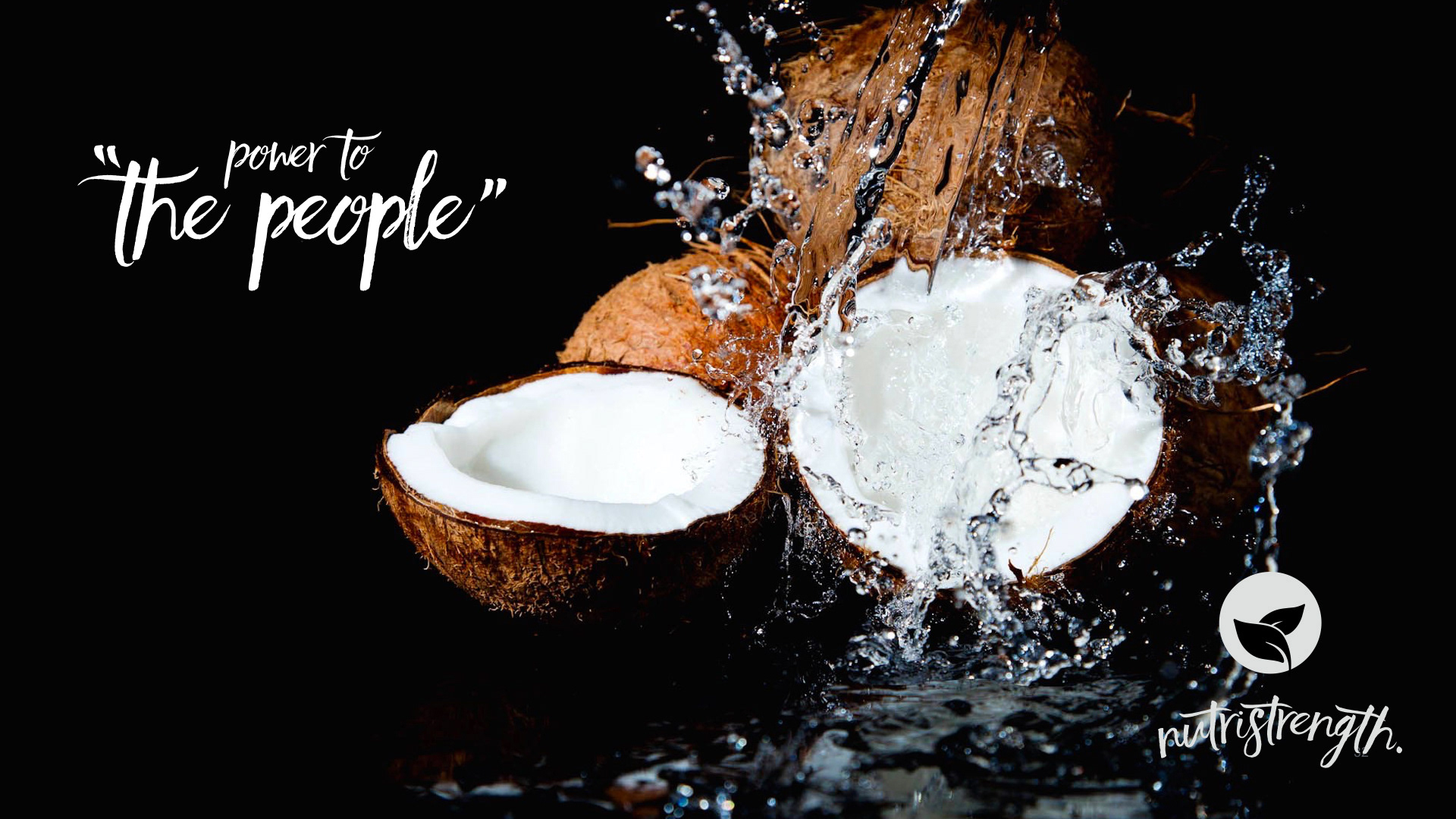
The chosen route...
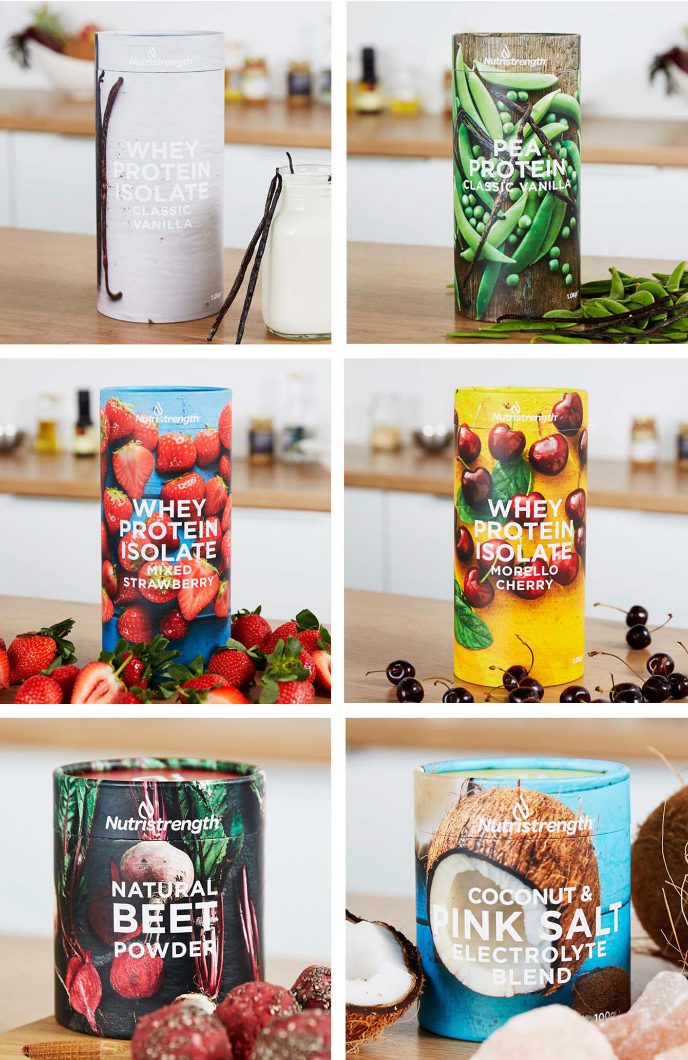
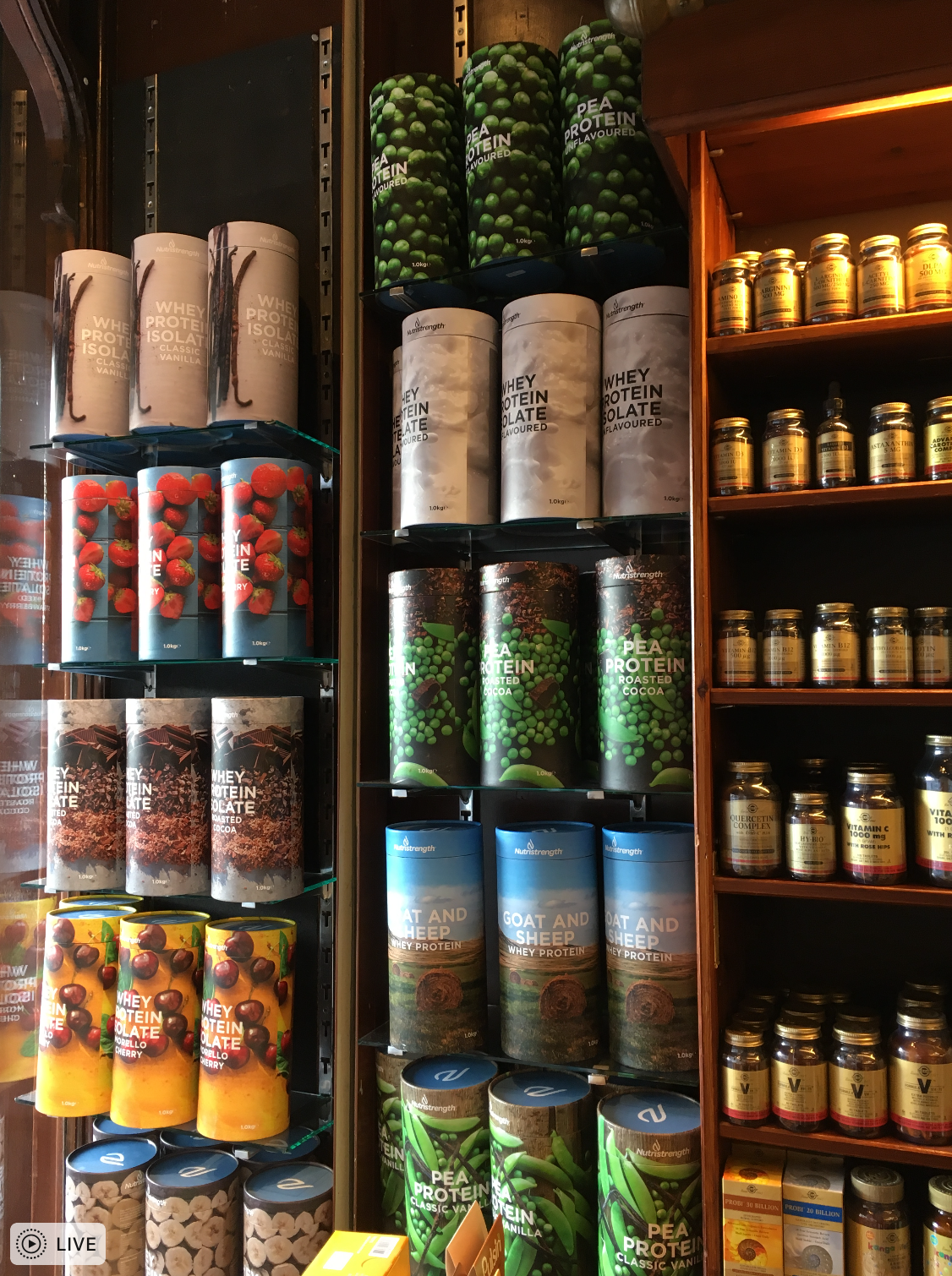
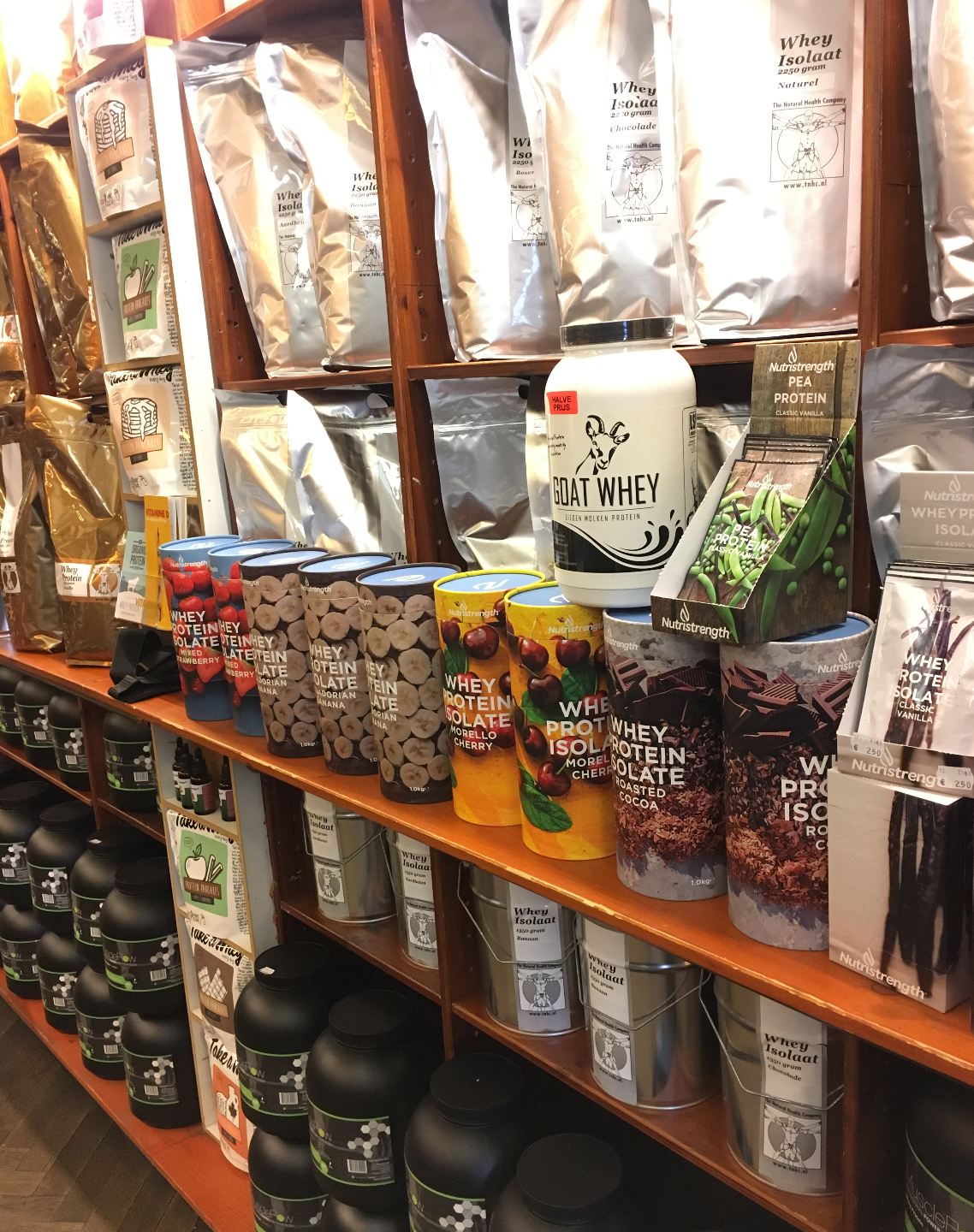
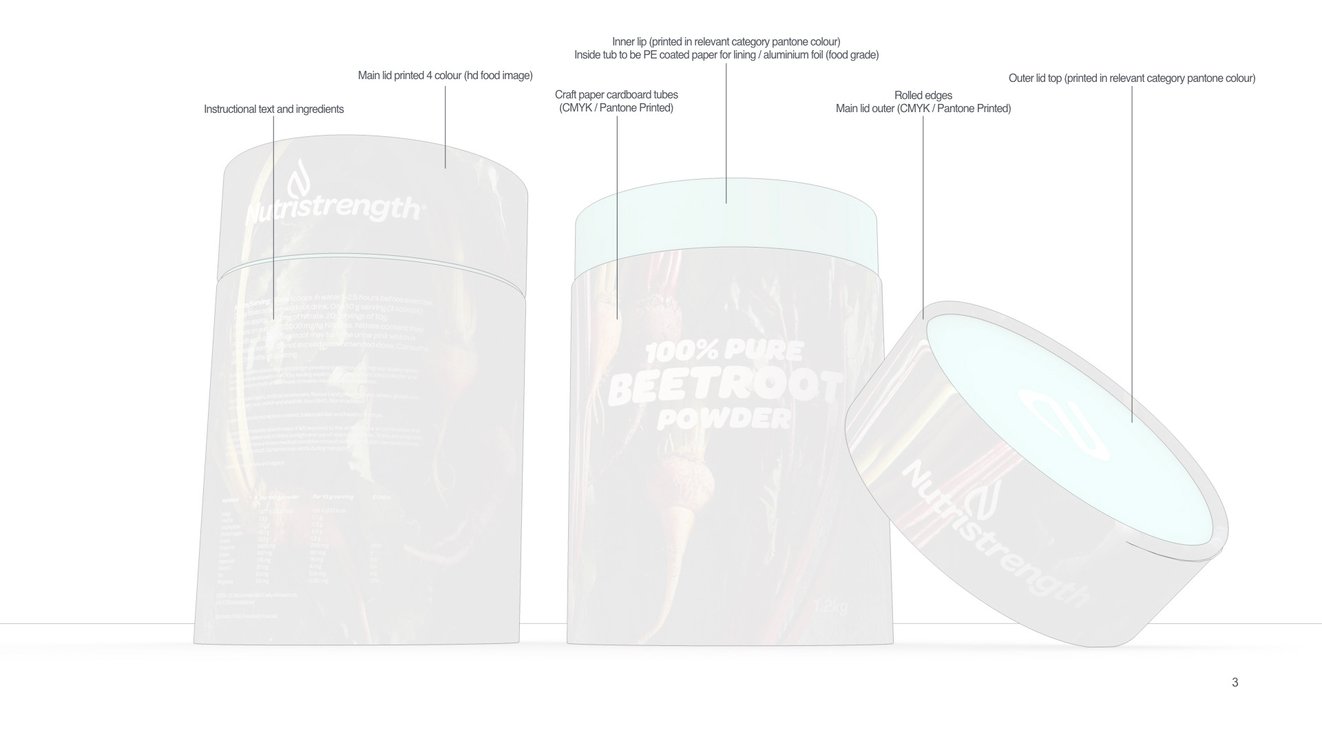
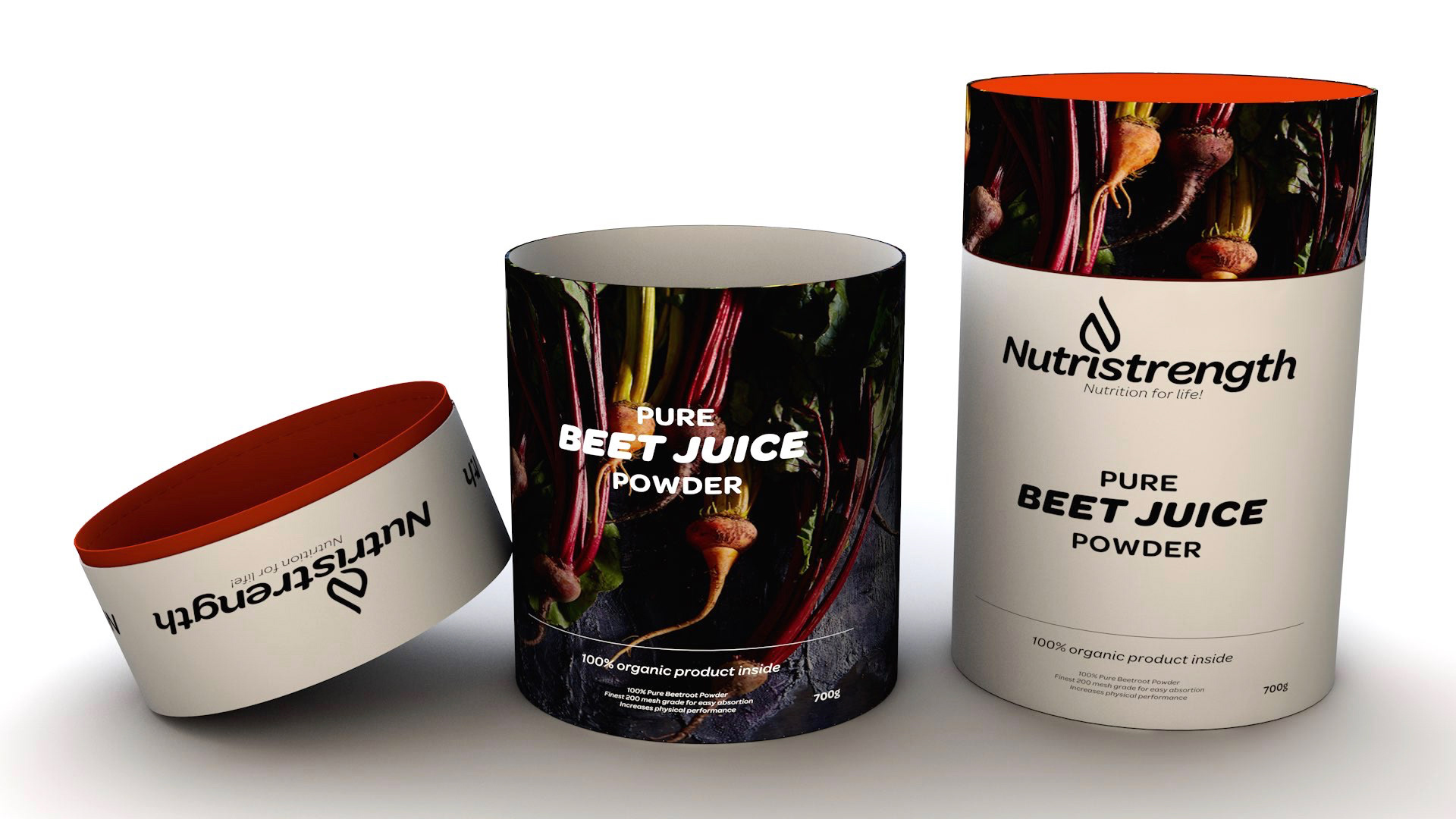
Packaging
The original packaging was masculine and overpowering, using large plastic tubs and drums to distribute their core product. We wanted to produce a package that felt considered, contemporary and something the customer would feel proud of - placing it on the kitchen side rather than in the cupboard.
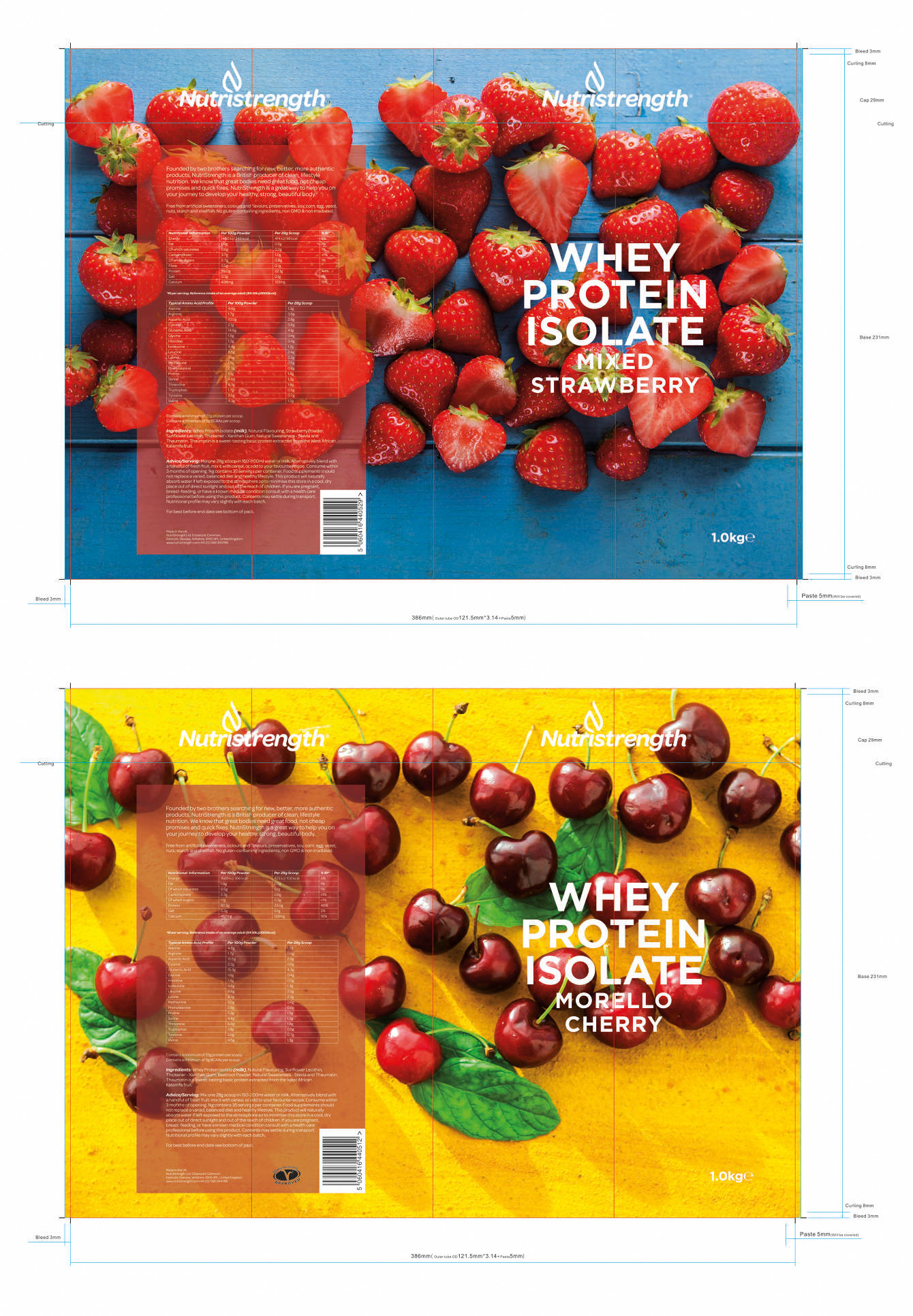
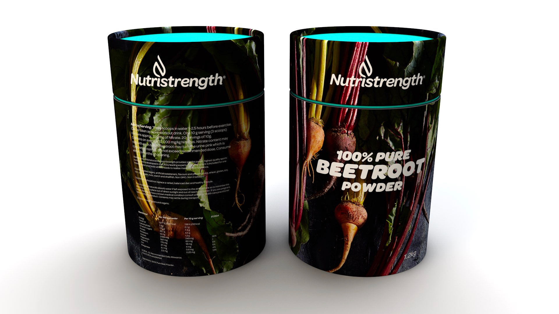
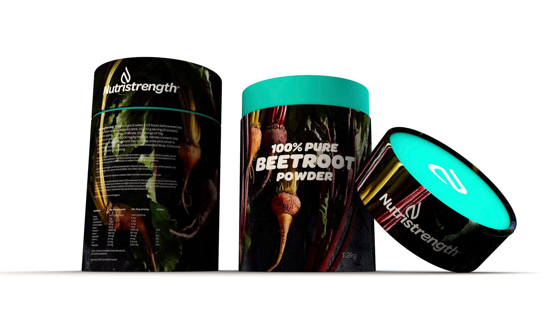
Product finals
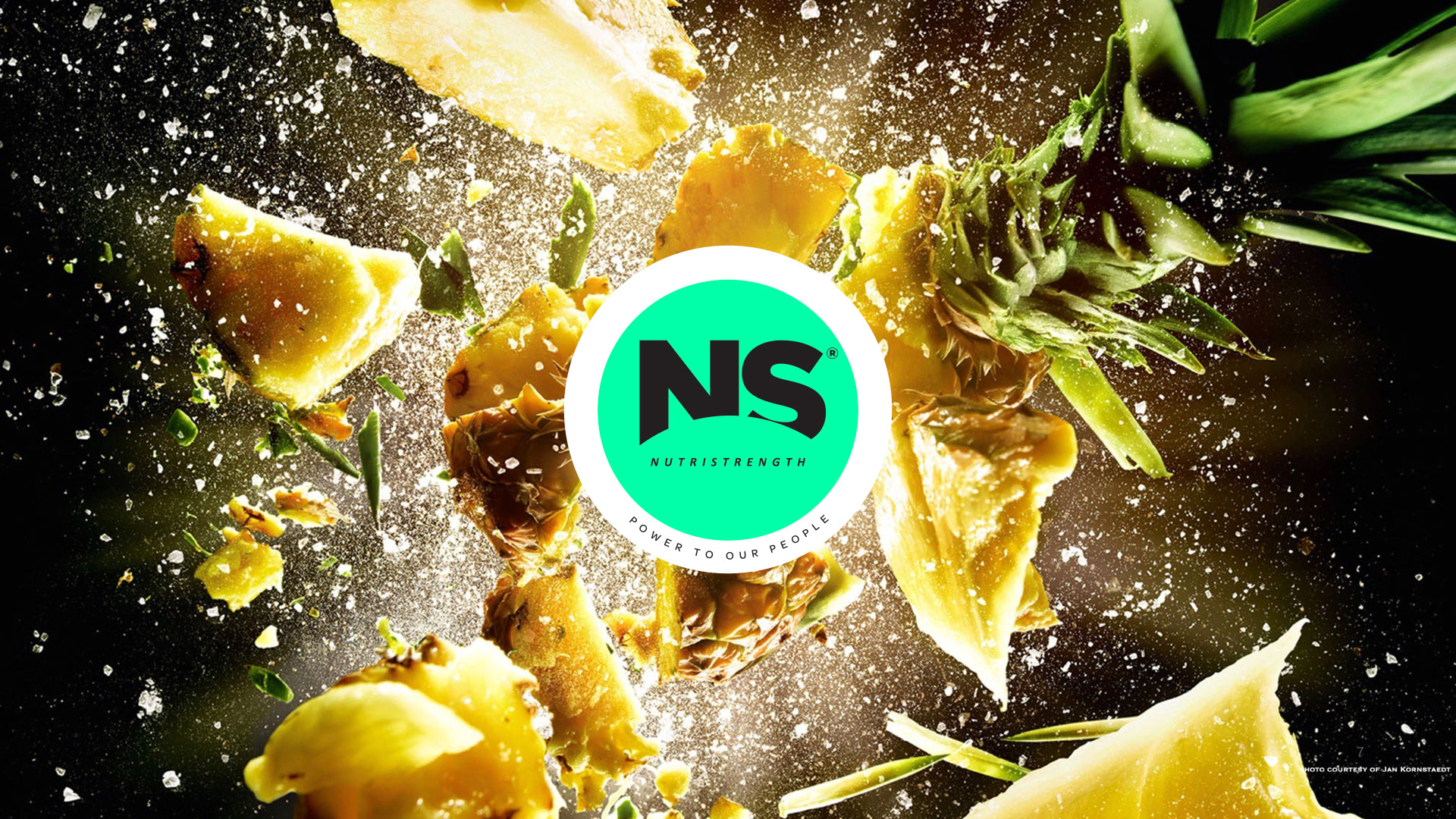
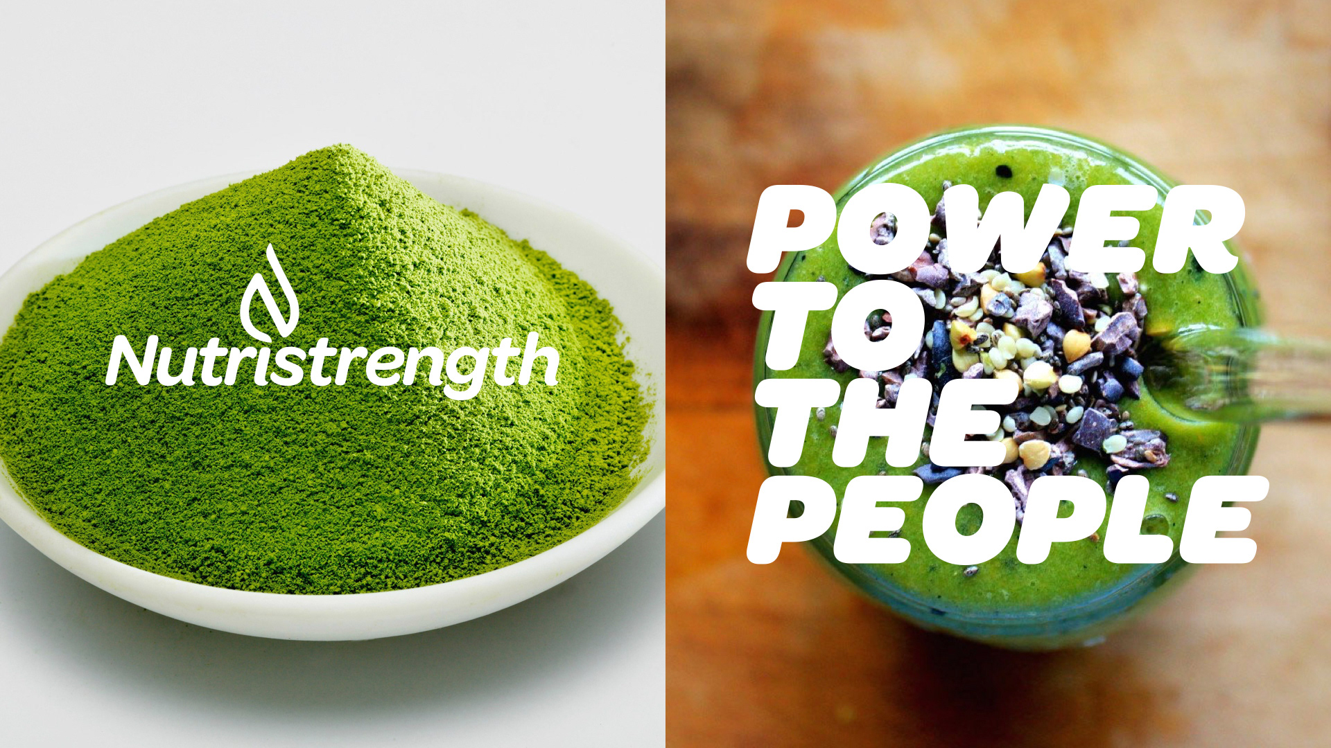
The final results speak fro themselves. A range of considered products that the brand are proud of. Nutristrength use the finest ingredients within their products and we wanted to bring the inside out - featuring them in full explosive colour.