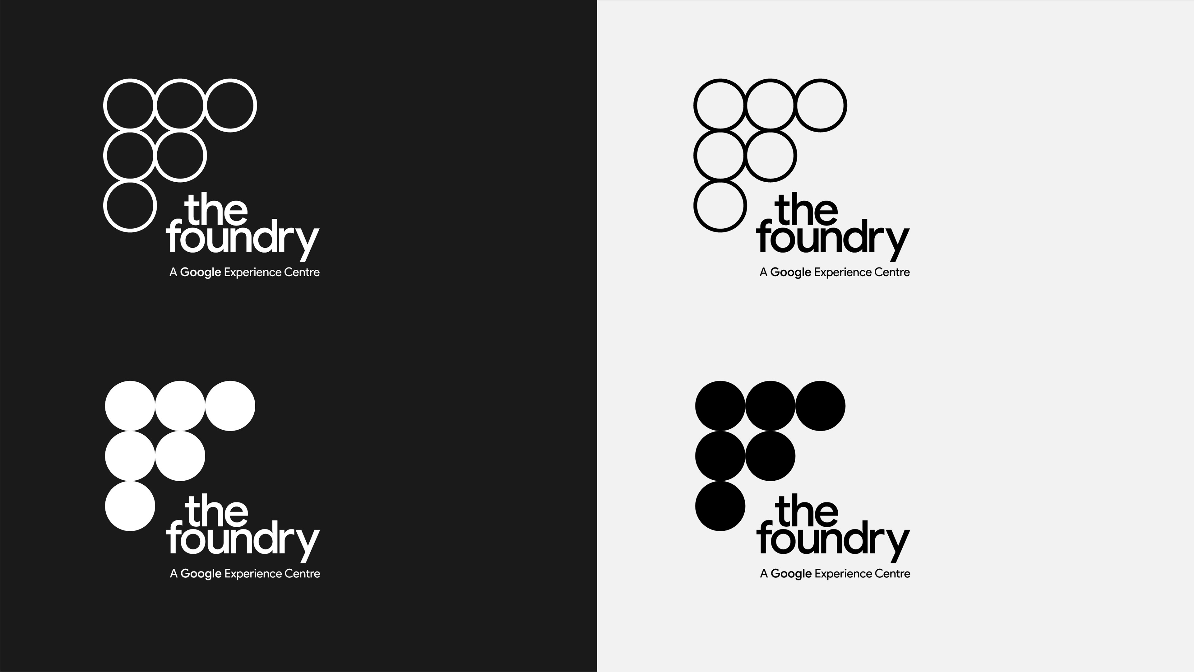
PB worked with a talented team at Sarner International and the good folks at Google to imagine a new brand identity for their upcoming Dublin Headquarters, The Foundry.
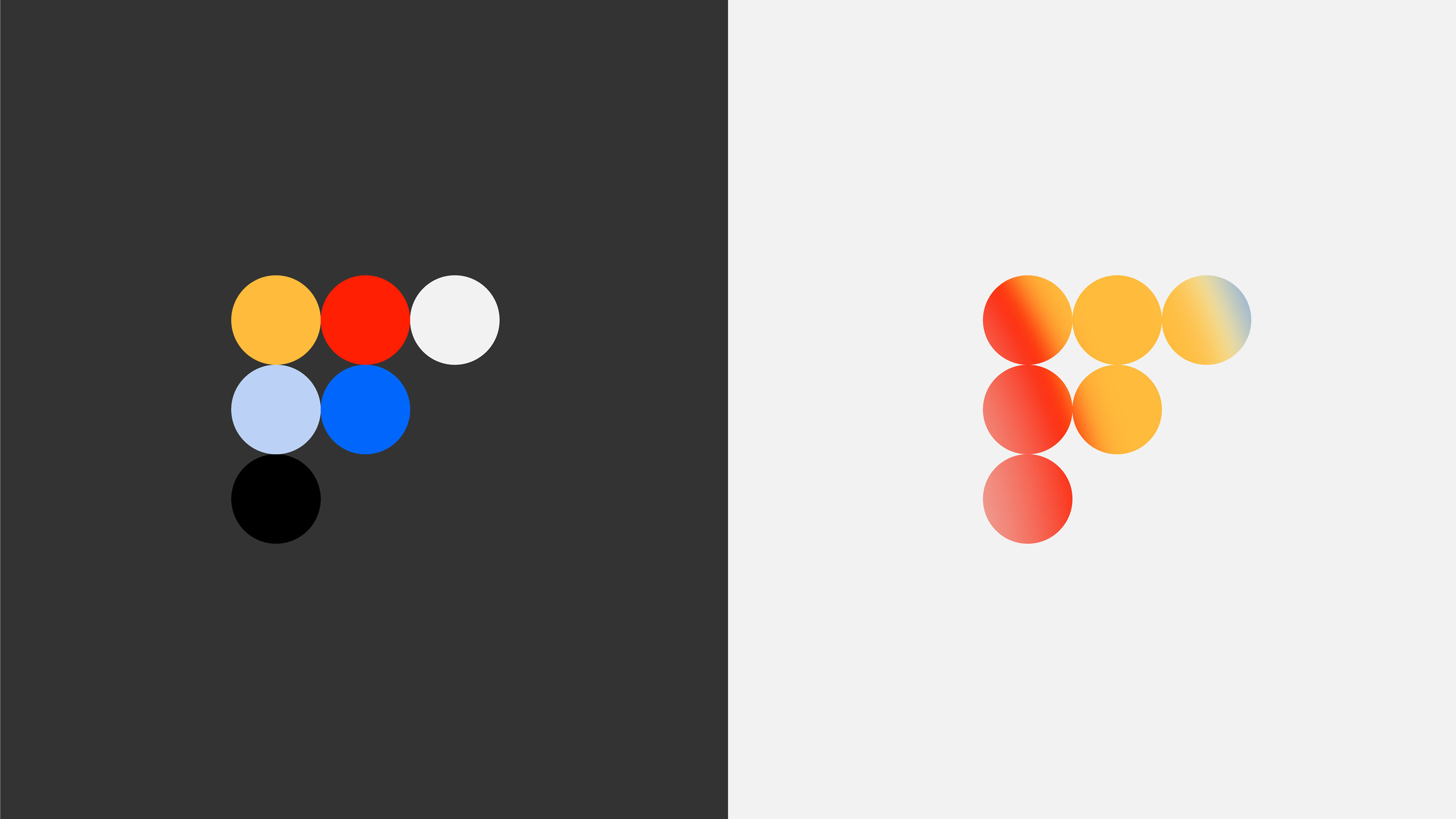
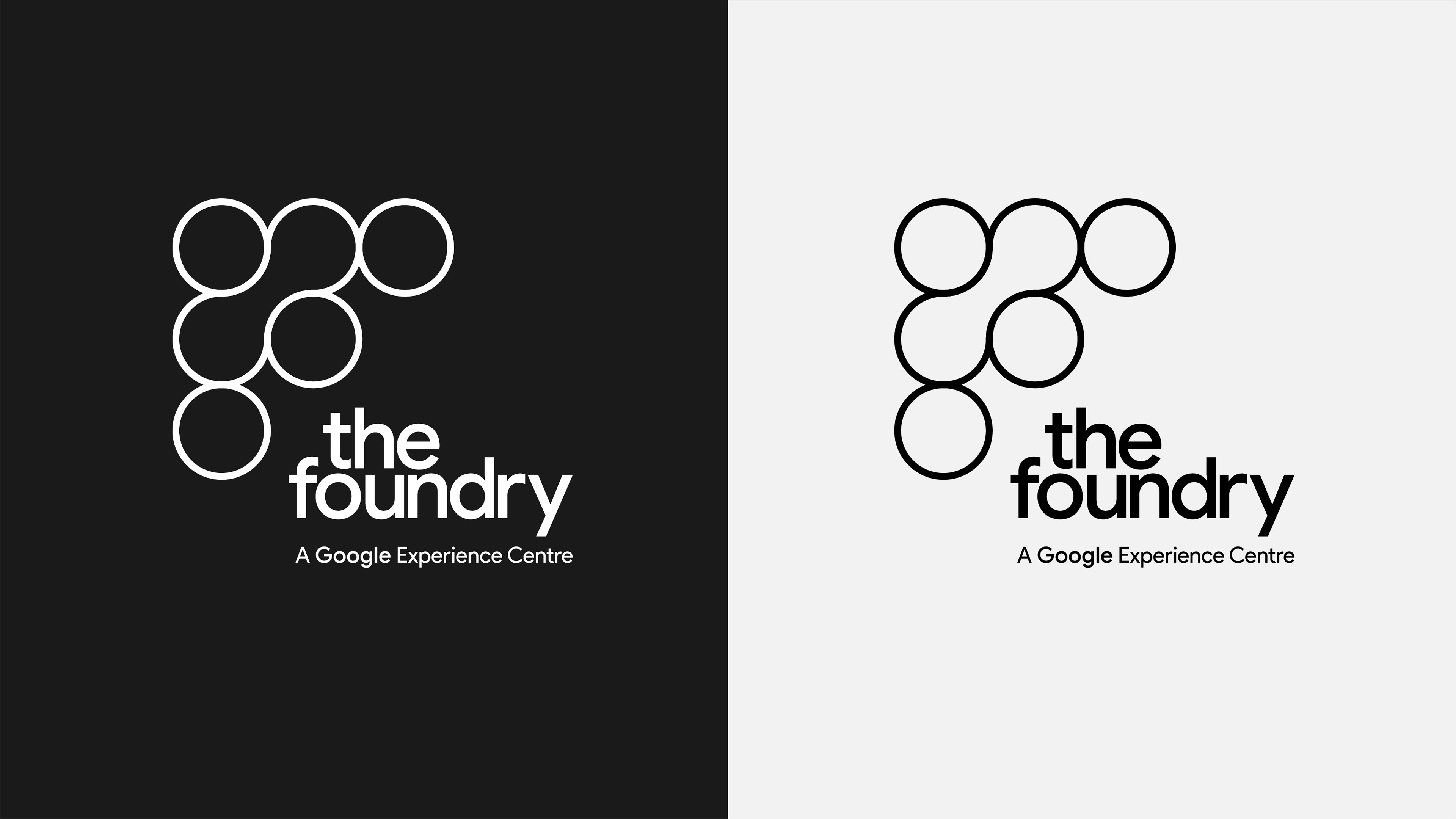
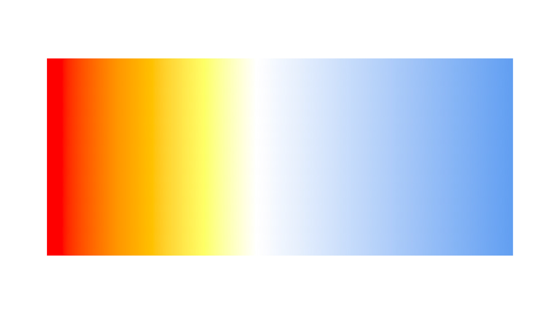
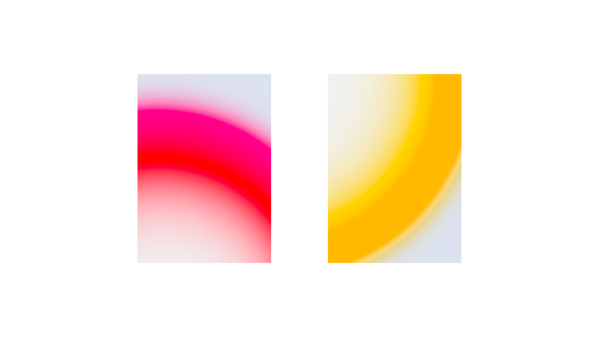
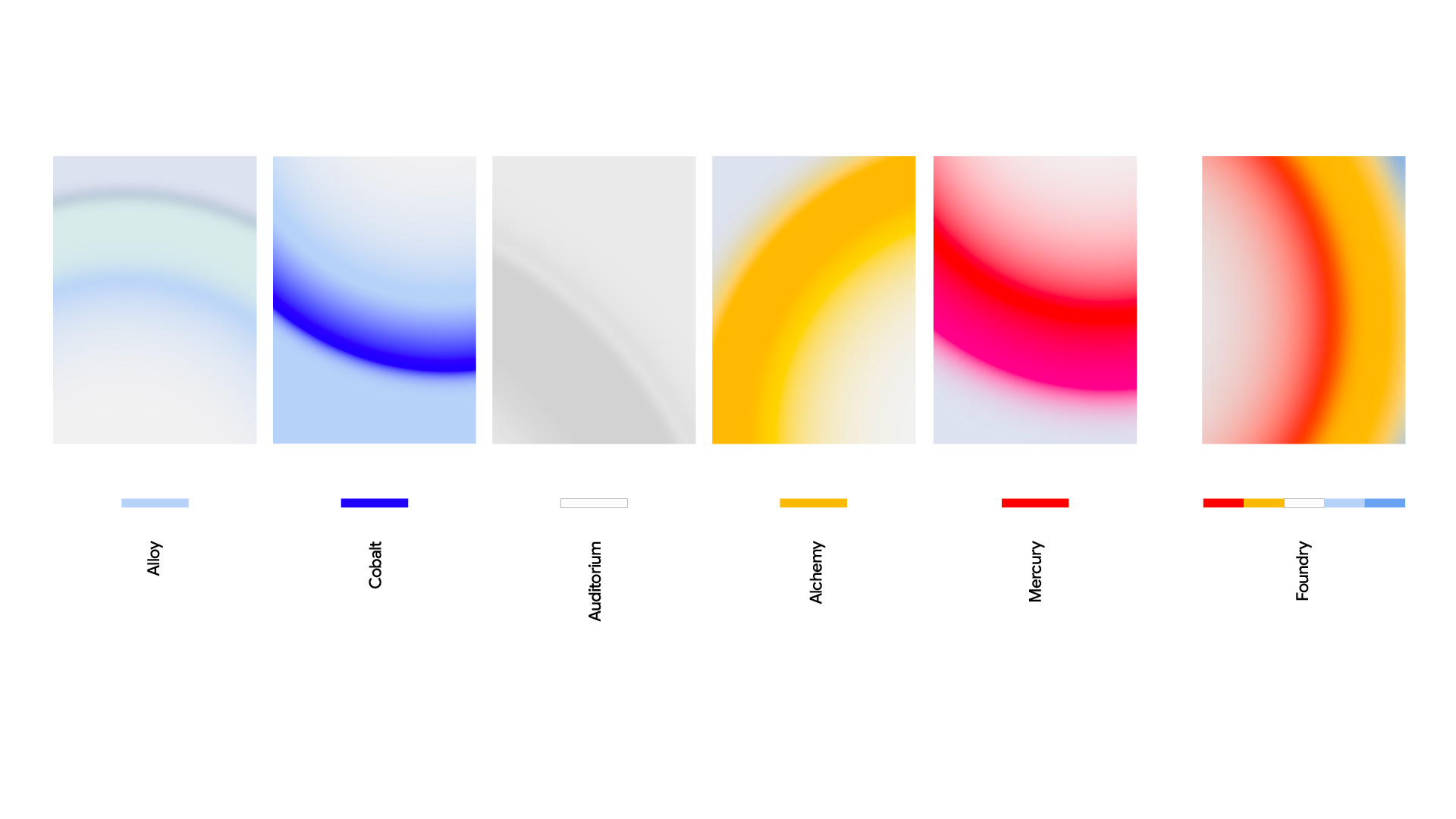
Using visual connections with heat, molten liquids, alloys and colour gradients, I was able to establish a theme that would carry through the building and its communications that felt fluid, simple and most importantly, Google.
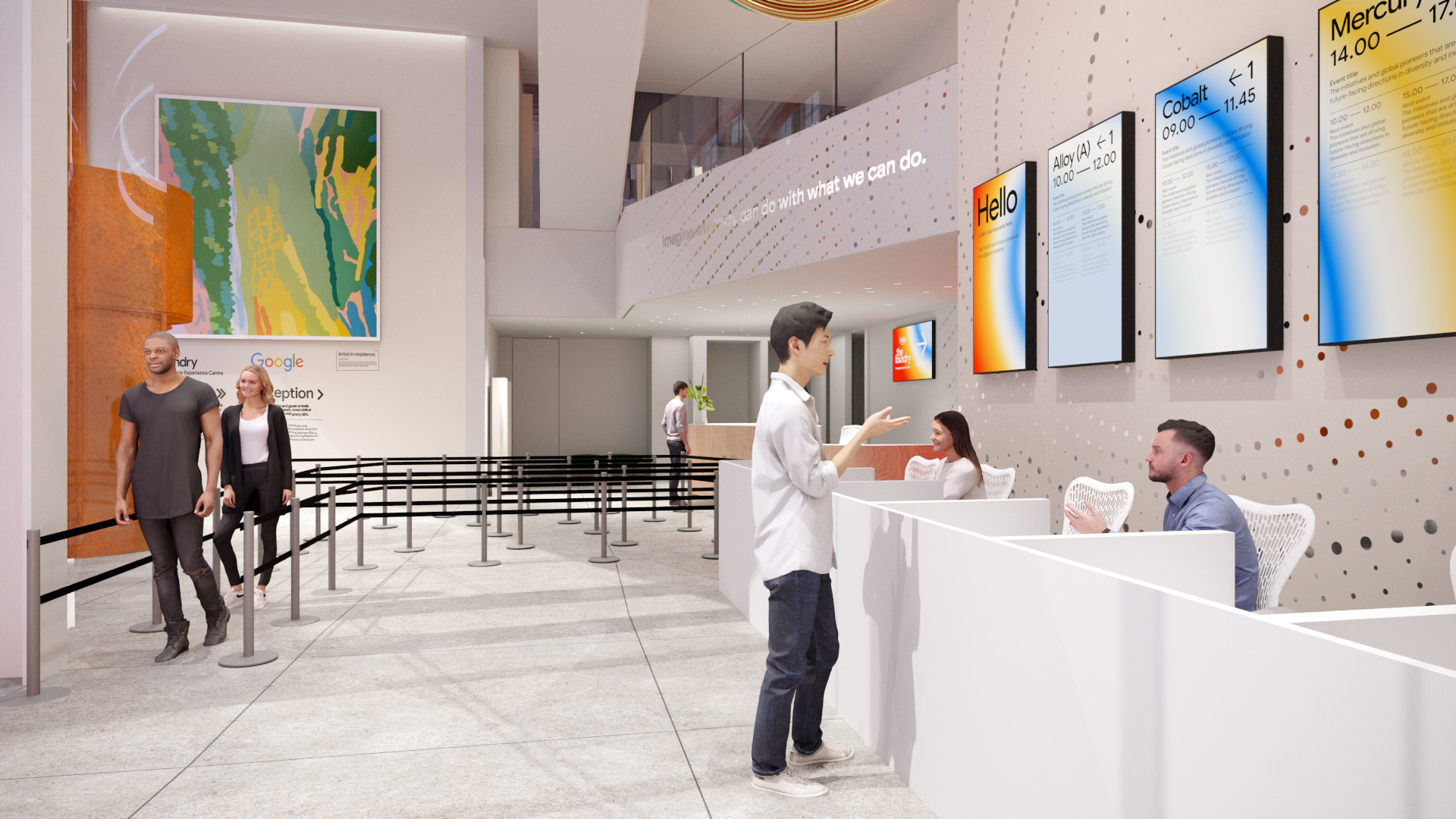
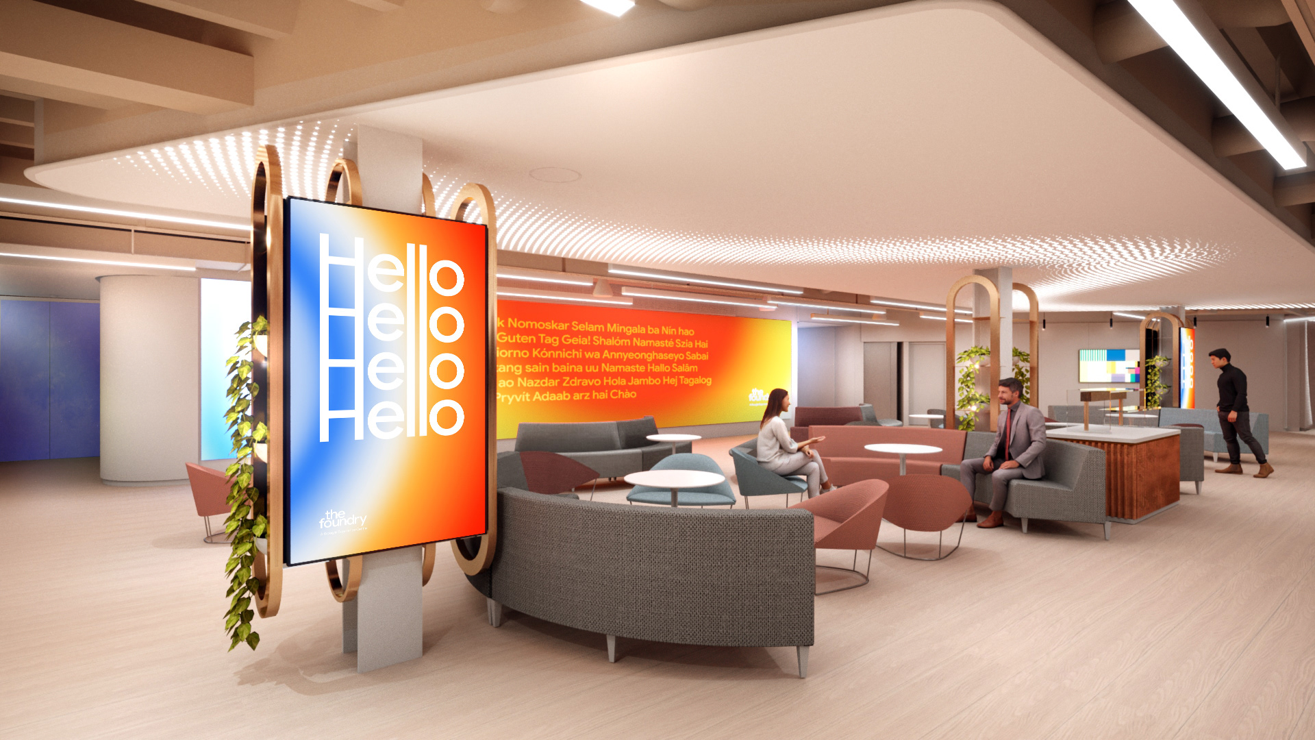
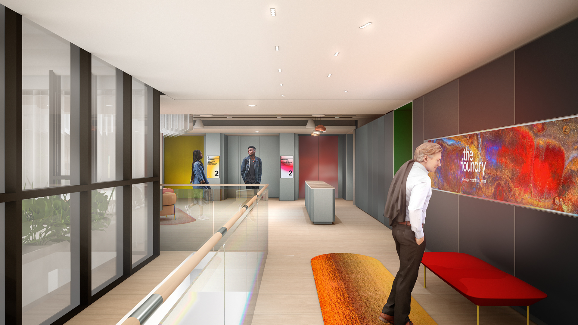
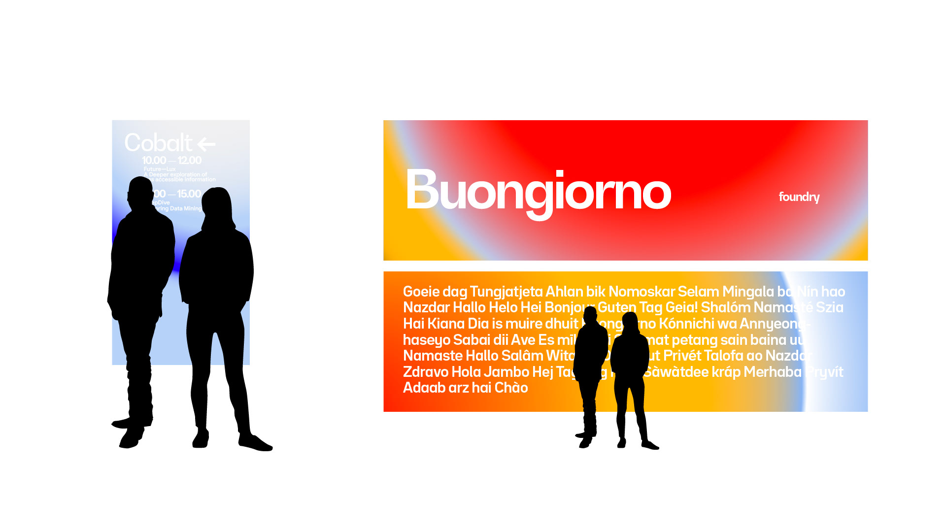
The identity had to scale digital and physical space, from signage and way-finding to digital comms, animated narratives and interactives.
Using visual connections with heat, molten liquids, alloys and colour gradients, I was able to establish a theme that would carry through the building and its communications that felt fluid, simple and most importantly, Google.
The identity had to scale digital and physical space, from signage and way-finding to digital comms, animated narratives and interactives.
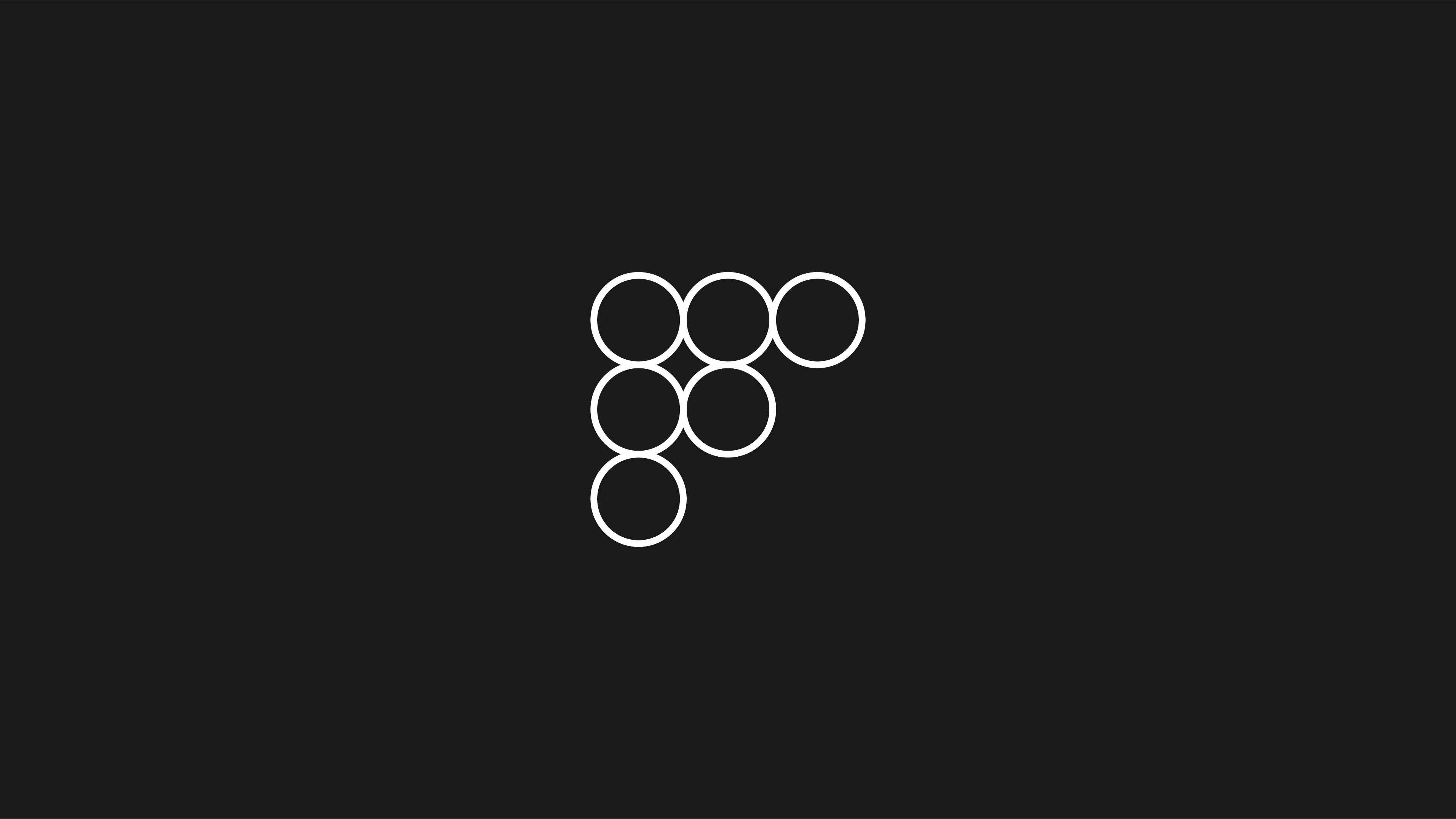
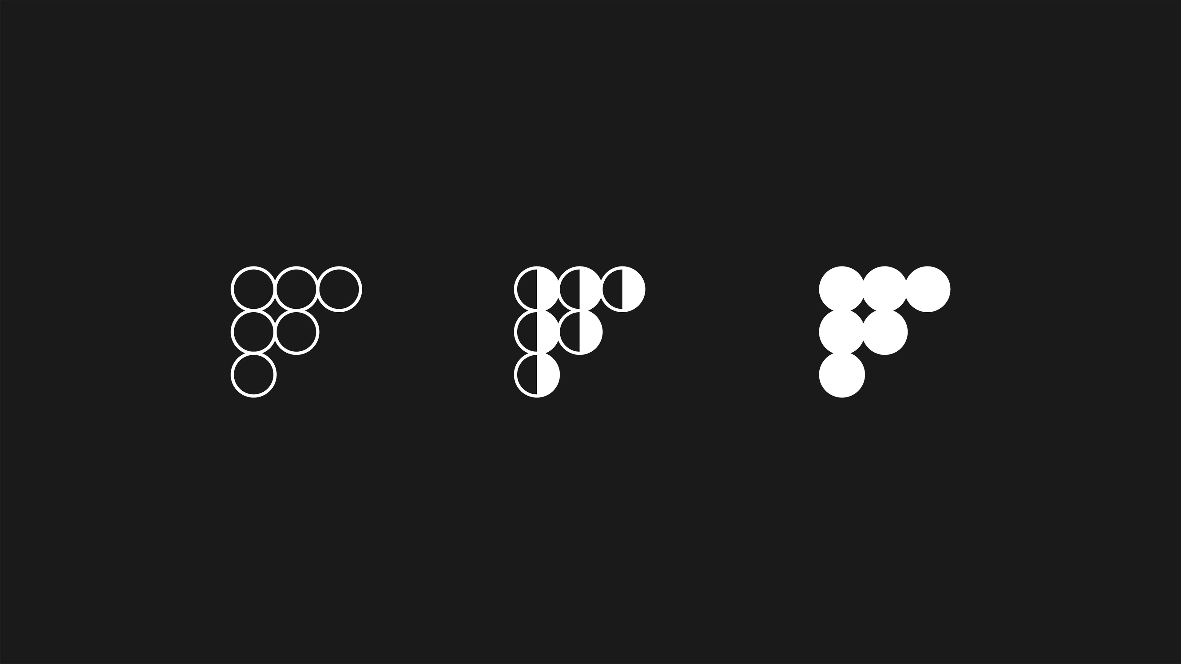
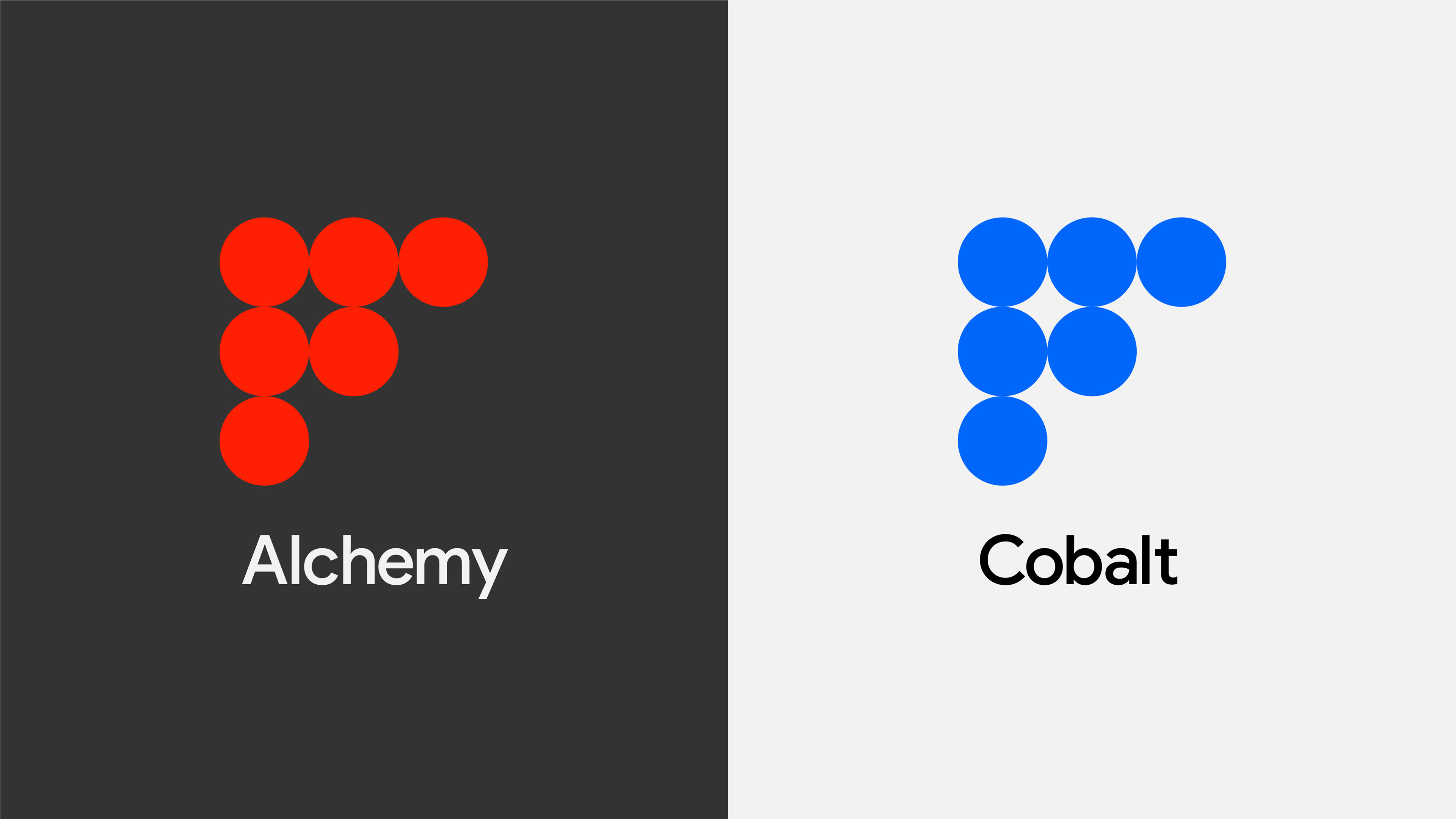
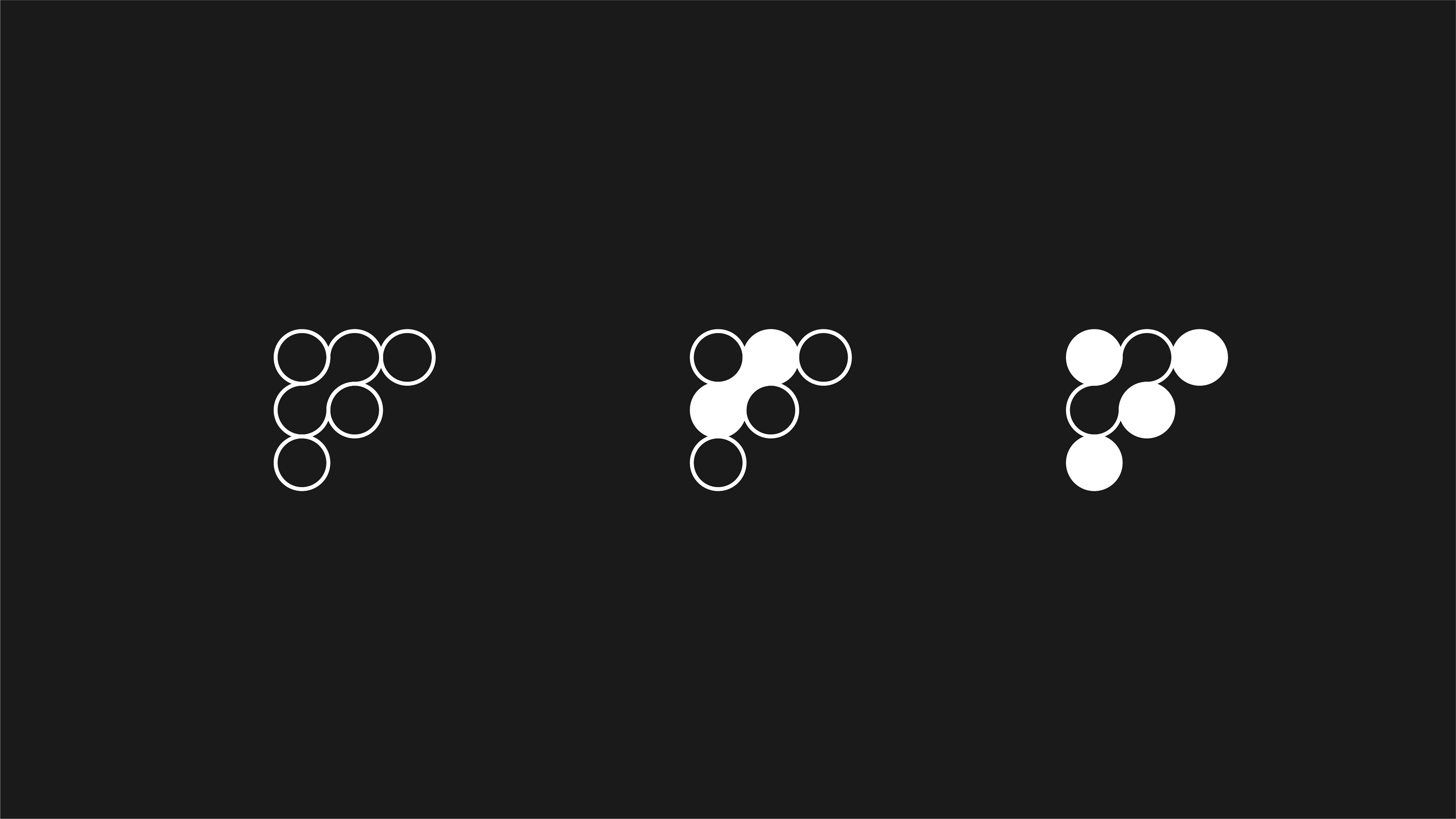
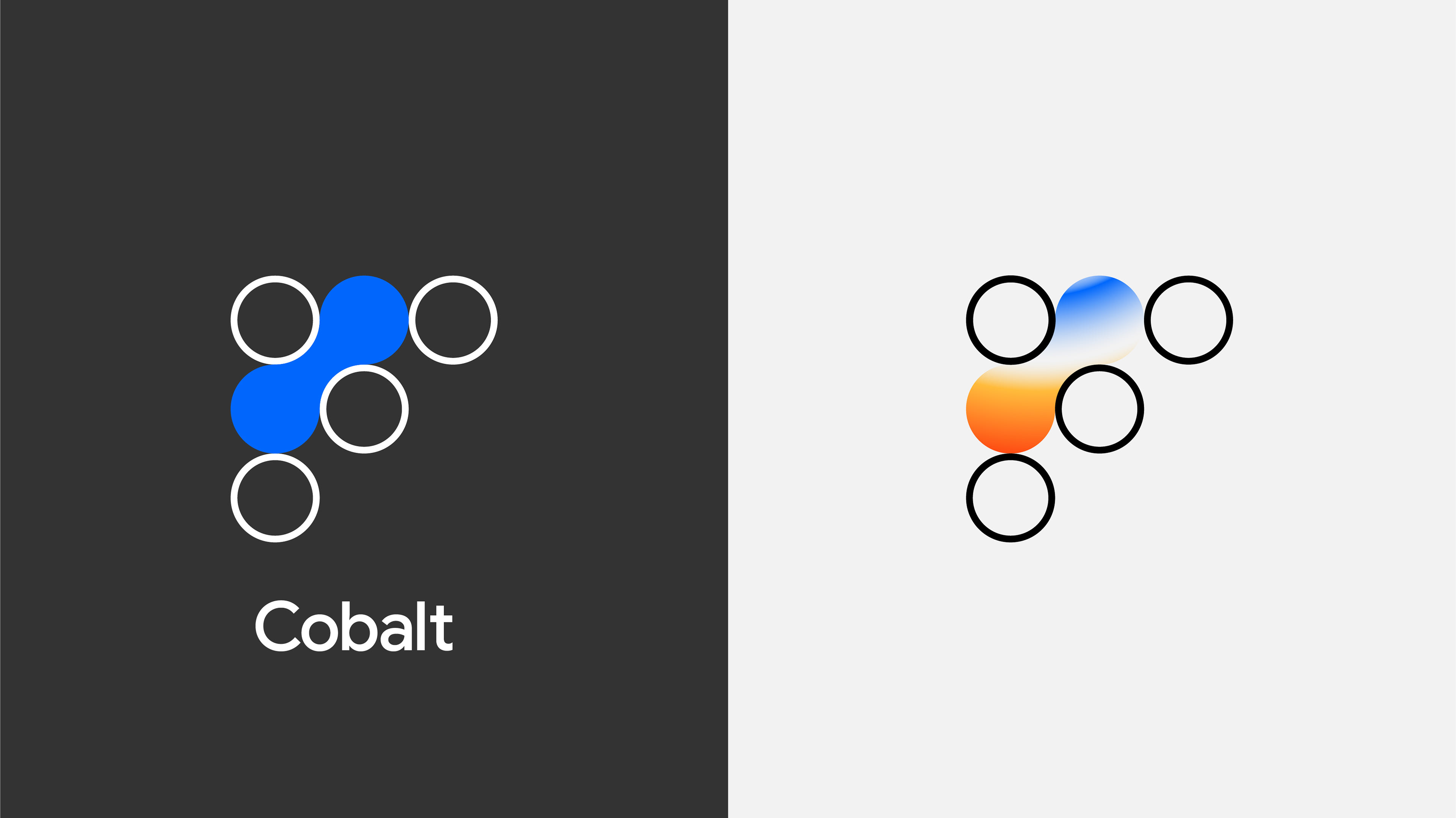
An alternative to the above identity was also researched, melding two of the circles in the "F" to form an object that felt like it was being shaped / squeezed between rollers, dialling into the molten nature of metals and materials associated with a foundry.
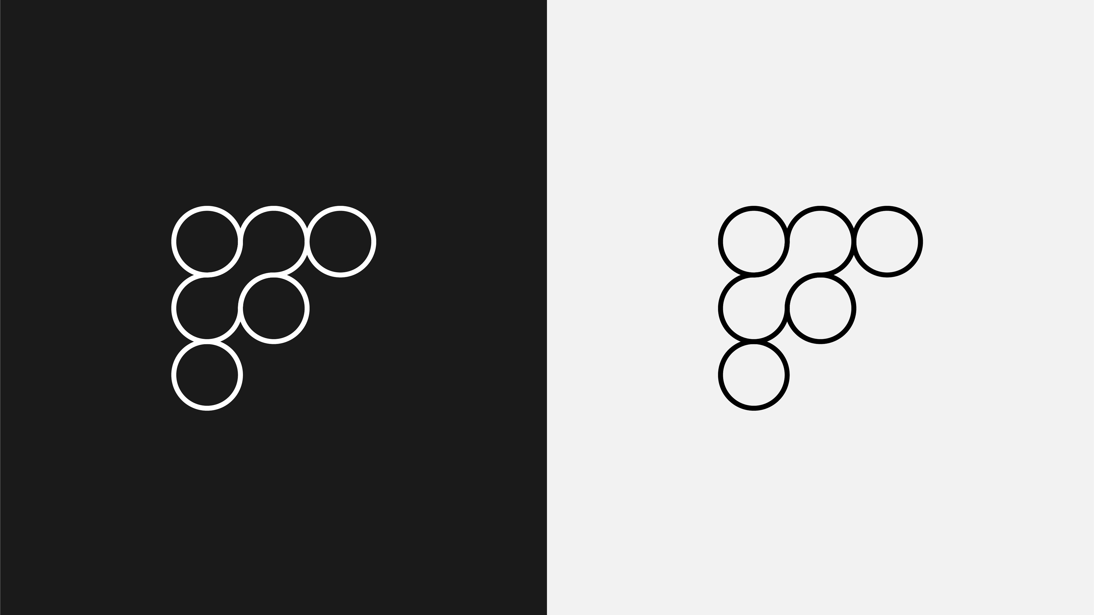
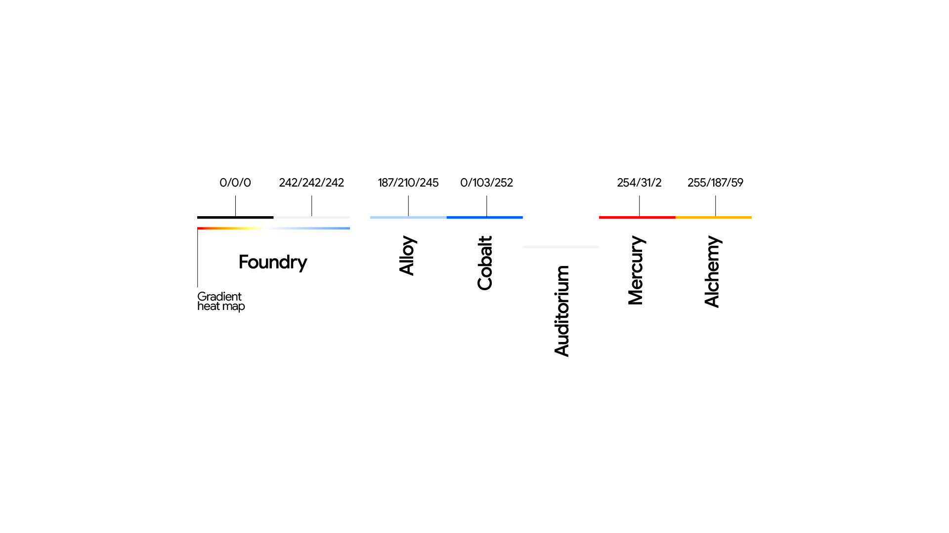
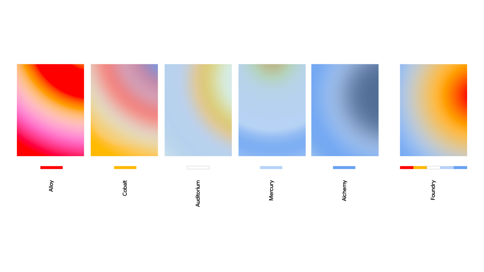
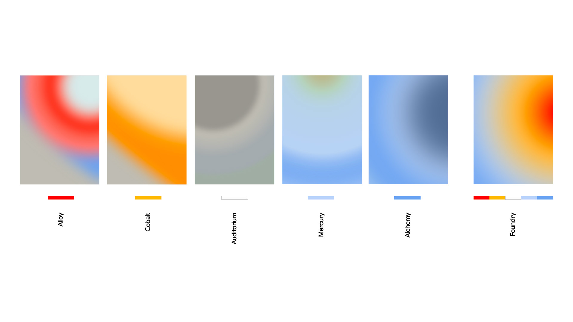
Visual Identity System
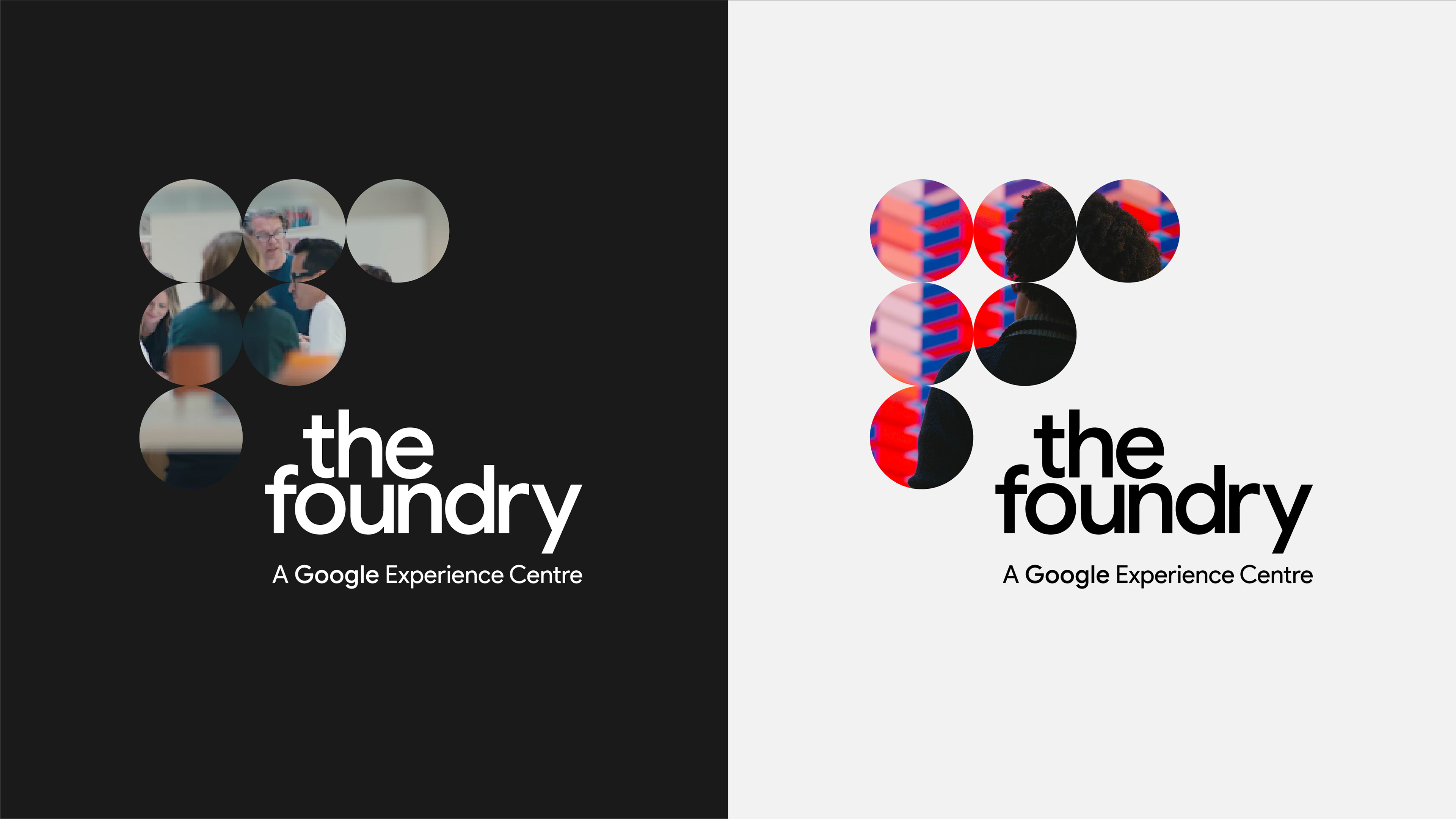
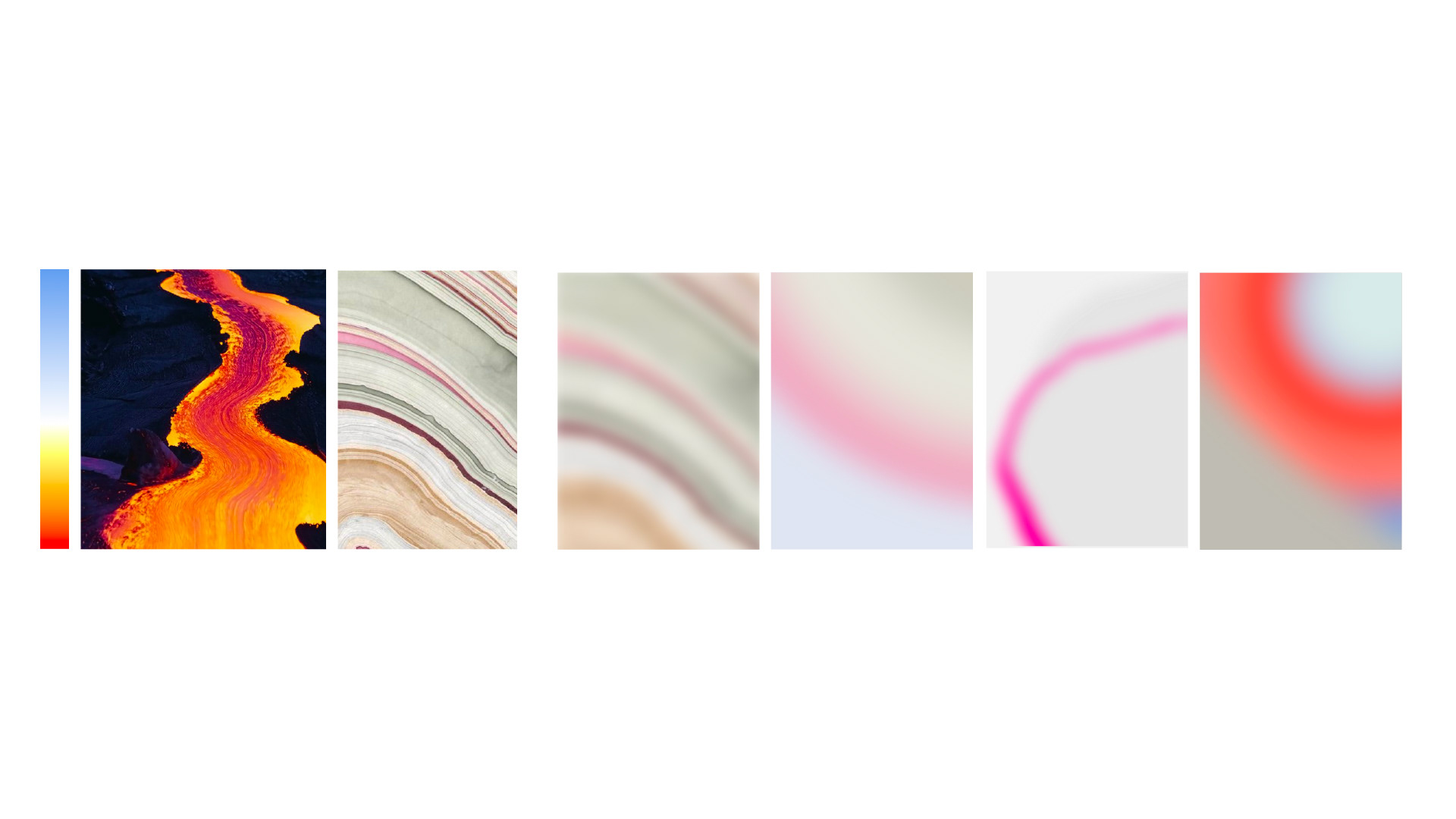
Taking visual queues from heat, heat gradients, molten metals and fluid movement. The visual identity captured the energy and intensity of metal in motion, feeling animated when static, and transient and abstract when in motion.
Visual Identity - Spatial design previs